
One Small Painting on a Compositional Journey
While teaching a four-week workshop focusing on composition for the Woodstock School of Art, I began this 12″x12″ painting.
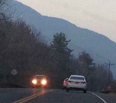
Here is the reference.
I almost always eliminate some detail from my reference photos, and change the location, size, shape and color of elements so much that I am recreating the image. Much as I am taken with the view that I choose and the moment in time it captures, everything I do pictorially is in service of the overall painting.
Here is my first version.

When I took the above shot I had already moved the white stripe twice, ending in a spot in between the other two tries. As you can see, I eliminated the cars to the right and the center line, which veers so sharply left that is squeezes against the car with the headlights (which is the focus of my painting) and divides the picture plane oddly.
I included the phone pole to the right and a very faint indication of the yield sign on the left.
I had several critiques, at this point, as I got away from the piece for a bit and came back. One was that the upper edge of the mountain too closely follows the top edge of the treeline, creating a shape that is less interesting than it could be and also encourages the eye to roll down and off the side of the picture plane to the right.
A successful composition keeps the eye circulating, starting with a focal point and then allowing it to move around the painting. This is something that is not so much a road map from the outset, but explored each time through a combination of conscious decision-making—where am I putting these headlights?—and intuitive painting. Then, when something doesn’t look quite right, getting it to where it does is a process of trial and error.
In terms of color, the blues of the mountain and the off-white of the sky seemed too bright for the time of day that would throw the road into such deep shadow. It is hard to see this in the photograph, but this brightness drew attention away from the headlights.
The below is my next version. I am starting to get an edge at the top of the mountain that is more interesting—not so bumpity-bump. I tried painting in a faint back mountain above and then painted it back out again. I gave a little more height and brightness to the yield sign.

The interaction between the tree line and the top of the mountain still didn’t feel right, and the shape of the shadowy trees going off to the right left me dissatisfied. I had been thinking about lifting the phone poll a bit higher, and decided to do that, as well create a higher shape on the right that alludes more strongly to trees or bushes on the right side of the road.
In what turned out to be my final version, I changed the direction that the highest tree is leaning so that it points toward a flat spot on the ridge line (rather than being an upward bump that presses toward another upward bump) and raised the phone pole—much better!
The yield sign went in and out a few more times and then stayed out—-I felt that, much as I liked the shape of it, it fought with the headlights for attention.
The final color is deeper and softer, with the addition of some reds around the headlights that are very subtly echoed in the off-white of the sky.
And last, I changed the curve of the bottom of the bushes as they meet the verge on the right, from a down curve that follows the white line to an up curve as the shape goes off the picture plane. That small adjustment, really kind of an after-thought, was my favorite tweak of all. It created a satisfying shape with the shoulder that funnels the eye back into the painting and toward the headlights.

Blue Mountain, 12″x12″
Because of all of the—to me, absolutely essential— changes, this small piece took more time to complete than the 30″x40″ that I did as a demo for the workshop, but which needed very little adjustment once I started painting. It is impossible to know at the beginning of the journey how long or complicated it will be!
The result of this particular journey is a simple painting, quietly moody.

Thank you Christie. So helpful to see and hear the detailed changes and why. The process. XoSheila
October 31, 2020 at 2:31 pm
Beautifully done and written. Instructive even for one’s life: ” A successful composition keeps the eye circulating, starting with a focal point and then allowing it to move around.”
October 31, 2020 at 3:50 pm
It is delightful to see your comment, Bob, thank-you! I am so glad that the discussion has wider implications…we are all so on edge during this home stretch that if I can in any way provide a meaningful diversion, that makes my day!
October 31, 2020 at 5:53 pm